Brand Background: Bridging Health with Modern Living
Routine Health+ is an independent brand specializing in functional nutritional supplements, tailored to meet the needs of urban consumers focused on maintaining their lifestyle and long-term health. As health consciousness grows globally, more people are turning to daily nutrition and supplements to support their well-being. Routine Health+ was created with the goal of not only providing quality supplements but also breaking away from the traditional "medicinal" look often associated with health products. The brand's design philosophy is to present a softer, friendlier image of health, making supplements an integral part of everyday life without the intimidating "drug" connotation.
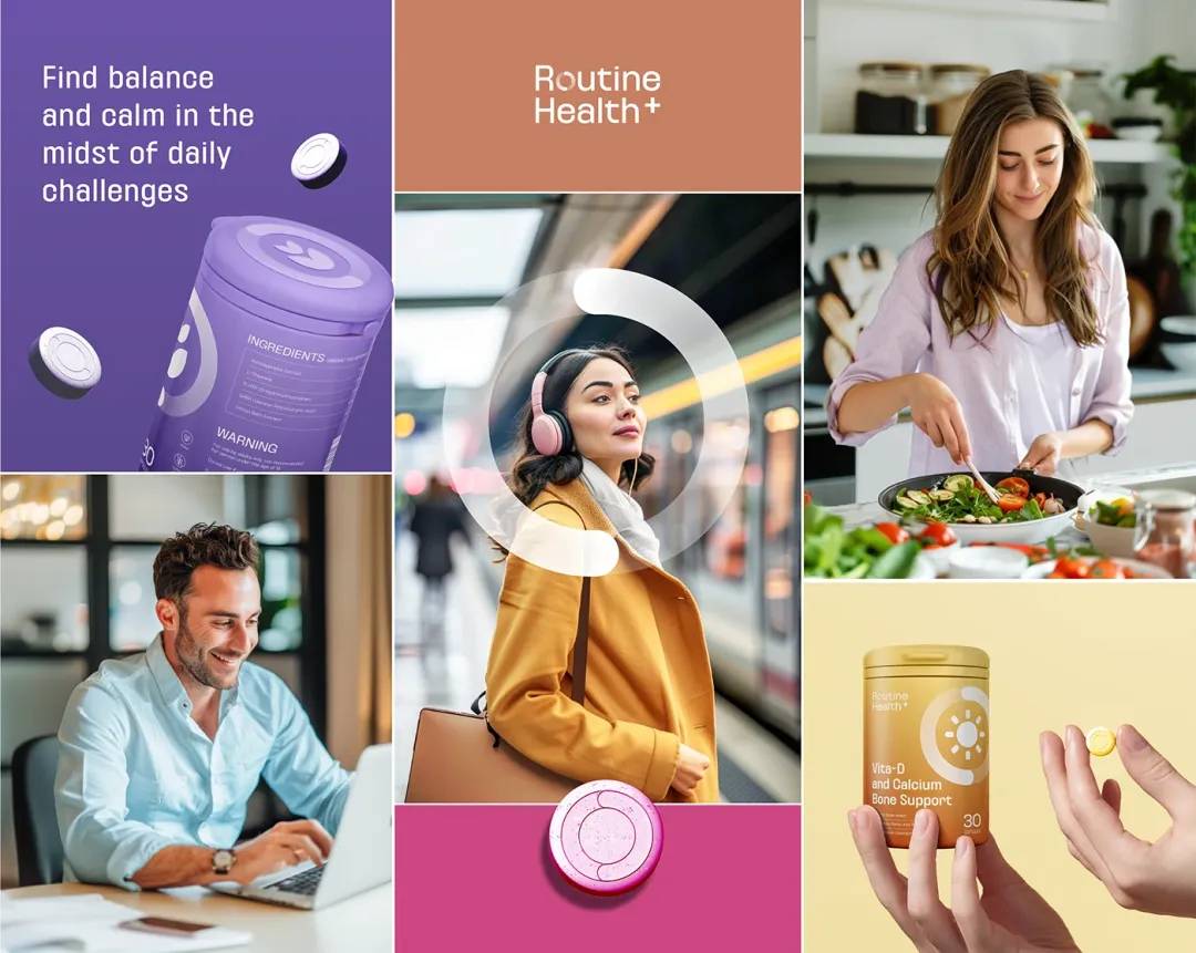
Routine Health+ aims to create a holistic, everyday health experience, moving away from pharmaceutical packaging and offering consumers a sense of personal care and wellness. The idea is to make supplements feel like a natural, easy addition to daily routines, seamlessly blending into a healthy lifestyle.

Design Concept: Minimalism That Instills Trust
The packaging design of Routine Health+ follows a minimalist style, characterized by clarity, simplicity, and a clean aesthetic. This design approach highlights the brand’s focus on offering accessible, everyday health support. The core concept revolves around “Routine” — symbolizing daily, structured health habits — and translating the idea of “regulation” into visual order. Below are some key design elements that bring this concept to life:
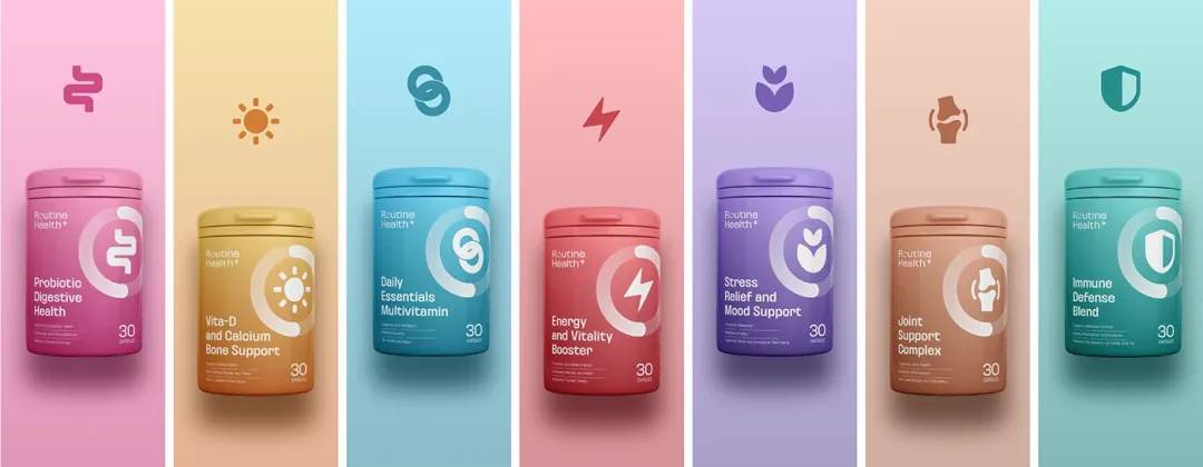
1. Unified Design System: Orderliness and Clarity
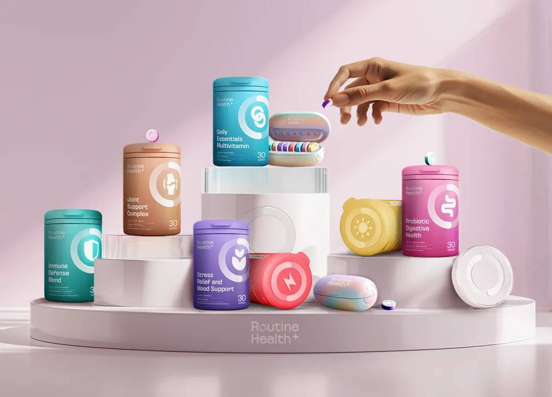
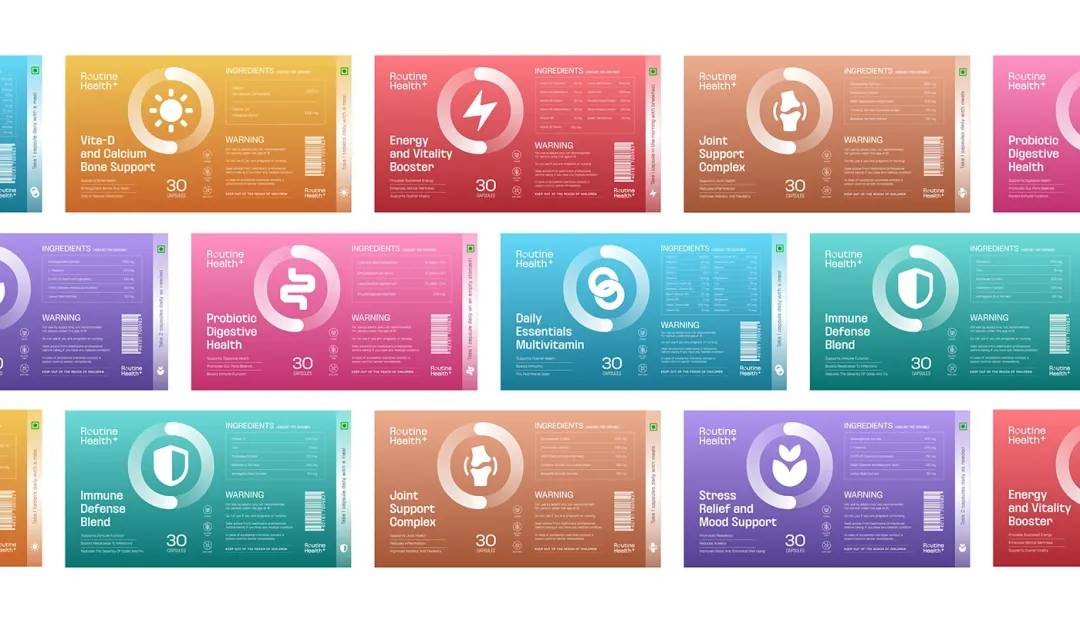
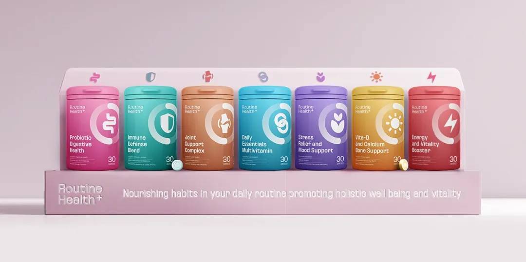
The entire packaging series features a consistent white background with a fixed layout structure, symbolizing rationality, cleanliness, and efficiency. The use of white provides a sense of purity and safety, instantly giving consumers a sense of confidence and trust. This consistent design also allows for great flexibility, making it easy to expand the product line in the future while maintaining visual harmony. Every product follows a clear layout that minimizes unnecessary visual distractions, allowing consumers to quickly understand the product’s functionality.
2. Modular Information Architecture: Minimizing Visual Clutter
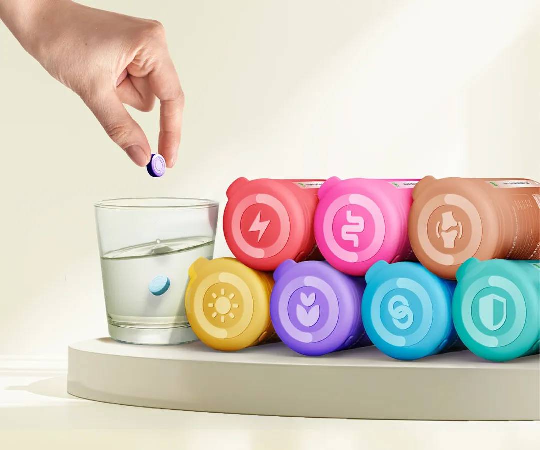
Each product follows a modular information structure, with consistent placement of the brand logo and function categories (such as Energy, Focus, Sleep, etc.) at the top. This allows consumers to quickly identify the product's purpose. The middle of the packaging is left intentionally blank to create a “breathing space,” reinforcing the minimalist concept. The lower section includes product descriptions and ingredient labels, clearly separated to help users easily digest information. This modular design reduces visual overload, making it easier for customers to engage with the product.
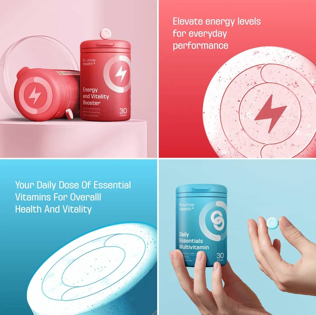
3. Color Palette: Transitioning from “Medical” to “Lifestyle”
In order to move away from the harsh, medicinal colors typically associated with supplements, the designer used soft, monochromatic blocks of color. These blocks — light blues, soft greens, and pale yellows — represent different product functions, such as stability, focus, and relaxation. These colors are not merely decorative; they serve as visual codes for each supplement’s intended effect. By applying these colors as horizontal “waistline” stripes, they become key visual elements that, when combined with the uniform font, create a strong recognition anchor for the brand.
This subtle use of color makes the product feel more approachable and less clinical, encouraging consumers to feel more at ease when selecting their supplements.
4. Material and Texture: Moving Away from “Plastic Pill Bottles”
The choice of materials for the packaging further distances Routine Health+ from the typical “plastic pill bottle” design. The matte finish of the bottle combined with a soft foggy label creates a tactile experience that feels more personal and luxurious. The bottle caps feature a fine-matte texture with rounded edges, softening the cold, clinical look often associated with pharmaceutical products. This tactile quality mirrors that of personal care or beauty products, reinforcing the idea of health as a lifestyle choice rather than a mere necessity.
5. Typography and Visual Identity: Enhanced Brand Recognition
Routine Health+ uses a sans-serif font, similar to Neue Haas Grotesk, which is simple, highly legible, and neutral in appearance. This clean, modern font ensures high visibility and recognition. The product names and subtitles are aligned in a grid layout, creating a sense of order and cohesion. This grid system ensures that each package remains visually distinct while contributing to the overall brand identity.
The “+” symbol in "Health+" is consistently used across the series, symbolizing supplementation, connection, and positivity. This recurring visual element also serves as a recognizable brand icon, making the packaging not only functional but also a distinct visual representation of the brand.
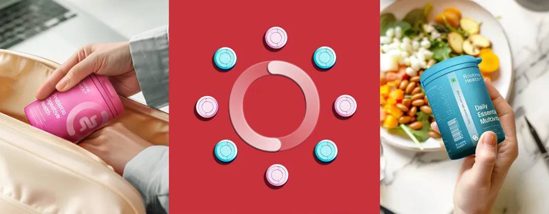
6. Series Design and Scalability: Future-Proofed for Growth
One of the most important aspects of Routine Health+’s packaging design is its scalability. The design doesn't just cater to the current range of products but is built to accommodate future expansion of the brand’s supplement line. The flexibility of the color palette, typography, and modular layout allows new products to be seamlessly added without disrupting the overall brand identity.
The modular nature of the packaging means that, as new products are introduced, the brand can maintain a consistent visual language. This scalability makes Routine Health+ well-equipped for growth, ensuring that as the brand expands its offerings, the new products will still feel like part of the same cohesive visual system. Whether it’s new health supplements for different concerns or seasonal offerings, the design system remains adaptable.
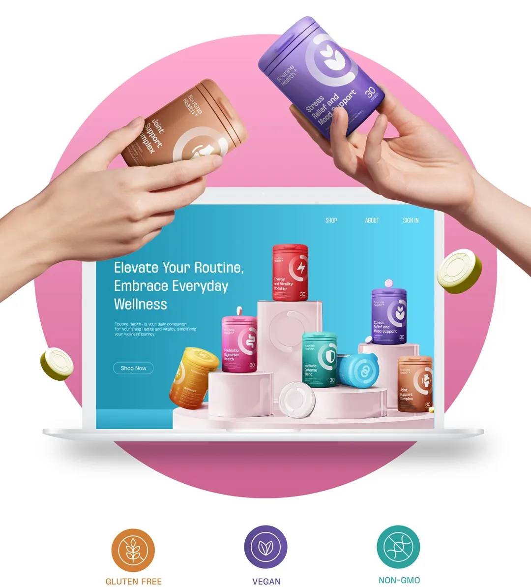
Furthermore, the series’ grid-like structure ensures that multiple products placed together on retail shelves or in online product images create a striking "matrix-style" visual effect. This makes the products not only easier to identify but also helps establish the brand’s presence, whether on physical retail shelves or in digital marketplaces like e-commerce platforms.

7. Versatility in Marketing: Consistency Across Different Platforms
Routine Health+’s packaging design is versatile enough to work across multiple platforms, including physical retail spaces and online environments. The brand’s consistent use of visual elements — from its color palette to its logo placement — ensures that the product’s identity remains clear and recognizable, regardless of where it’s displayed.
The minimalist design helps make the product stand out on crowded retail shelves, drawing consumers’ attention with its clean lines and organized layout. In digital spaces like e-commerce websites and social media, this same simplicity translates well, allowing the brand to stand out in an often cluttered digital environment. Clear, well-structured visuals combined with a modern, approachable design help Routine Health+ maintain a strong and consistent identity across multiple touchpoints.
8. Sustainability: A Thoughtful Approach to the Environment
As sustainability becomes an increasingly important consideration in the global marketplace, Routine Health+ has also thoughtfully incorporated eco-friendly practices into its design process. While this article focuses primarily on the visual and functional aspects of the packaging, it’s important to note that the brand is committed to using recyclable materials where possible. This is an important aspect of modern health brands that appeals to eco-conscious consumers.
The use of matte finishes and soft foggy labels not only elevates the tactile experience but also helps minimize the amount of plastic used in the packaging. While the materials themselves are high-quality and durable, the brand’s commitment to sustainability helps reinforce its modern, thoughtful approach to health and wellness.
Conclusion: A Modern Approach to Health Supplement Packaging
Routine Health+’s packaging design is an innovative and thoughtful approach to the evolving world of health supplements. By breaking away from the traditional, often clinical packaging typically associated with supplements, the brand has successfully created a modern, approachable image that appeals to consumers looking for a seamless integration of health into their everyday lives.
Through a combination of minimalist design, functional modularity, and an emphasis on clear, accessible communication, Routine Health+ has redefined what health supplement packaging can be. It’s not just about selling a product — it’s about creating a visual experience that instills trust, promotes health, and seamlessly fits into the rhythms of modern life.
As the brand continues to grow, its scalable design and adaptable system ensure that it will remain a recognizable and trustworthy presence in the ever-evolving health supplement market. Routine Health+ has shown that thoughtful design is an integral part of building a successful health brand, one that consumers can trust and feel confident in choosing every day.
Final Thoughts
Routine Health+ sets a new standard in supplement packaging design, combining modern aesthetics with practicality. The clean, minimalist approach not only creates a visually pleasing experience but also speaks to the growing demand for health products that are as approachable and simple as they are effective. By keeping the consumer experience in mind, the brand has crafted packaging that not only enhances its visual appeal but also aligns with the needs of today’s health-conscious, design-savvy consumers.